_Kent College
Kent College, Canterbury is a co-educational private school for boarding and day pupils between the ages of 3 months and 18 years
Client
Kent College, Canterbury
Services
Visual Design, Branding, Print and Exhibition
Industries
Education
_Branding
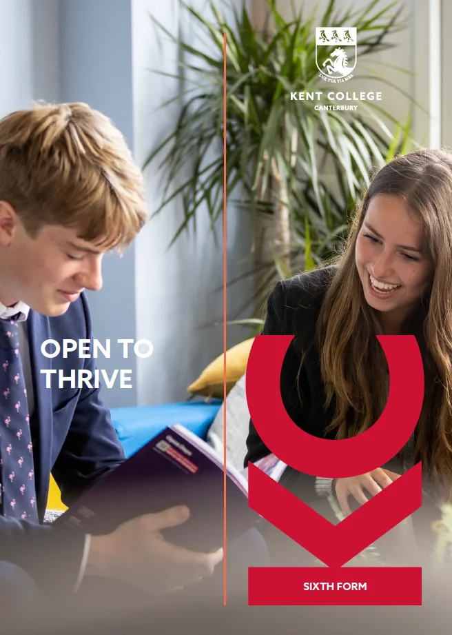
Working within Kent College's heritage identity — the crest and its deep crimson — we developed a bold graphic language built around a cropped 'KC' monogram. Used large and bled off the page, the monogram becomes a confident framing device that gives the school's collateral instant recognisability, while a vivid red-and-coral palette and a clean geometric sans-serif bring warmth and modernity to a traditional institution.
_Print
We designed a family of prospectuses under the 'Open to Thrive' message, spanning the Junior School, Seniors and Sixth Form. Full-bleed photography of pupils sits alongside the monogram and a fine keyline motif to create covers that feel energetic and personal. Inside, dense information is made approachable: daily routines for day pupils and boarders are set as clear, colour-coded timetables, while sixth-form outcomes and university destinations are presented as bold statistic panels and an illustrated map of the UK.
_Exhibition
The system extends to large-format display work, including welcome banners that pair the oversized 'KC' device with photography and the school's 'open to' messaging — carrying the same voice and visual language from the printed page to the campus environment.
_have a project like this?
Tell us what you’re making and we’ll come back with straight answers.
Start a project →Next project
Kings Daughter